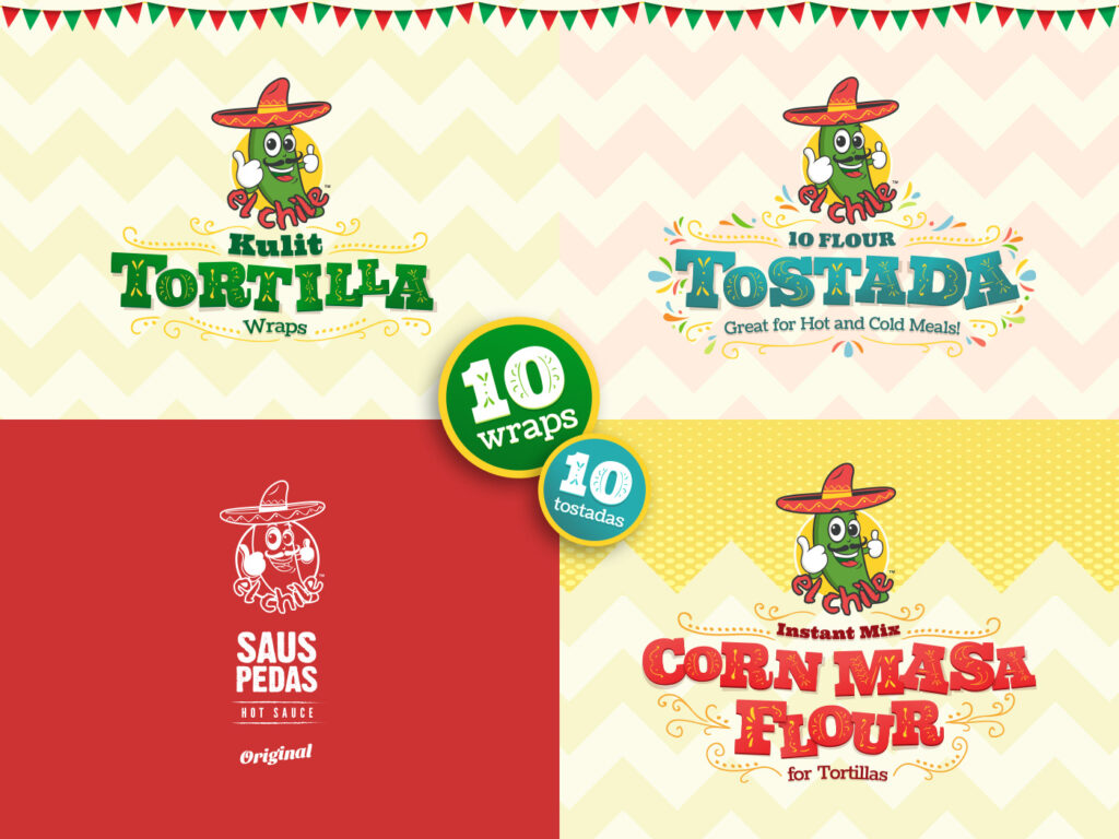
El Chile is a brand in Bali that has been introducing authentic Mexican products into the local market. Following the steady growth of their corn chips product line, they are expanding to other product line as well, such as tortilla wraps, tostada, Mexican hot sauce, and corn masa flour. As the family rapidly expanding, an effective branding solution is needed to unify all these products under one sombrero. We also have to take into account that some elements from their existing successful product, the corn chips, have to be retained for brand consistency. We decided to create a unique typography style for the product titles adorned with festive Mexican decors, this visual system will accommodate any future product additions with recognizable brand familiarities.
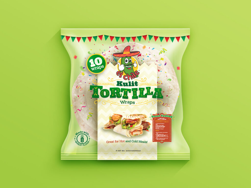
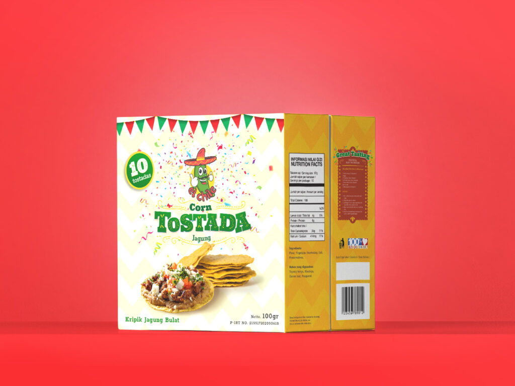
Taking pride in the quality of their product, we help design a tortilla wrap packaging that focuses on displaying the freshness of the content. The packaging is mostly transparent, modern minimalist, with bold accents of Mexican festive touch. For the tostada packaging, we created a custom structure for the box according to the ideal dimension needed, This is to preserve the product nicely and give it a unique presence among its competitors on the store shelves.
With the hot sauce and bottle ready for production, a label design is needed to give the hot sauce a fiery and outstanding presence on the table and shelves. The design needs to take into account the local printing vendor’s capability, especially in terms of a transparent labels with solid colours, or provide an alternative option without. We designed a modern-looking, simple and clean white label with a subtle Mexican touch in the typography styles.
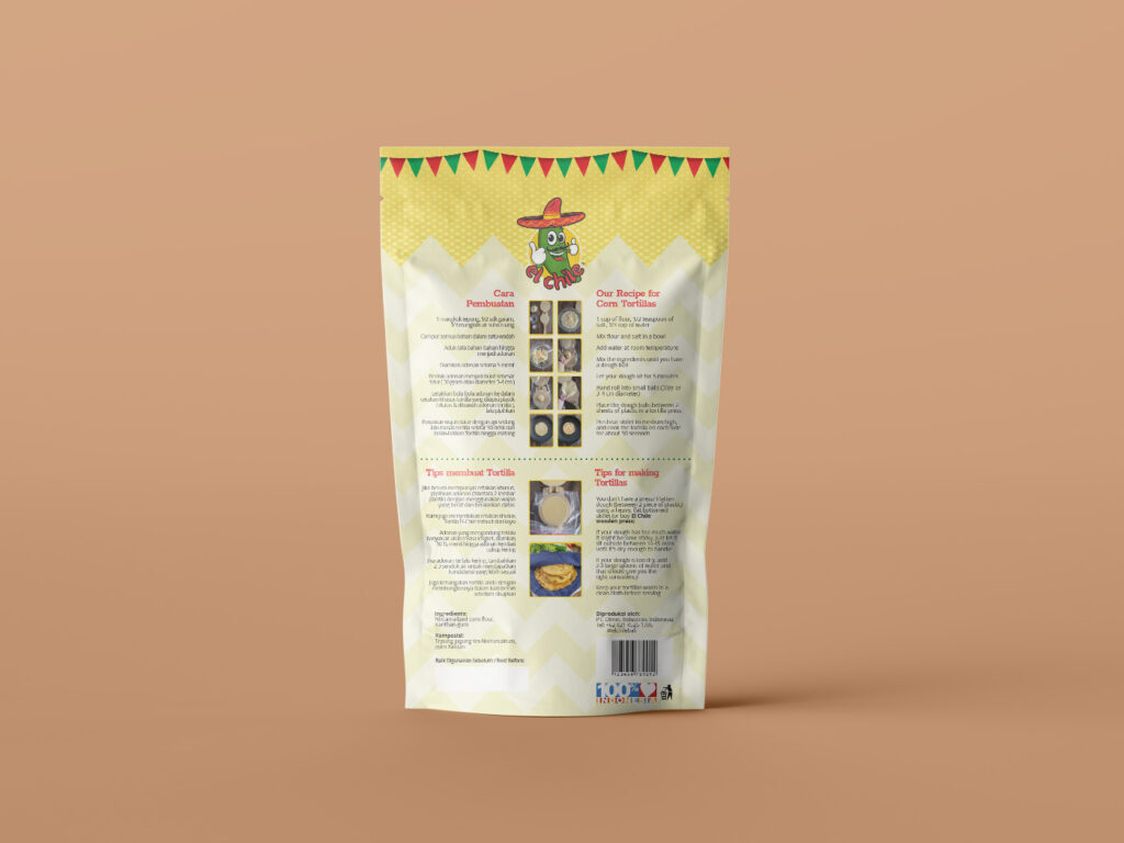
For the corn flour packaging, a pouch design with a window is selected to provide buyers a sneak peek of the product quality, this conveys the brand’s pride and confidence. Utilizing the overarching brand visual system we developed, the product title will be custom-made yet retain familiarity and brand consistency with the other products. To give the design a unique differentiating accent, we created a corn kernel pattern on the upper side of the pouch.


