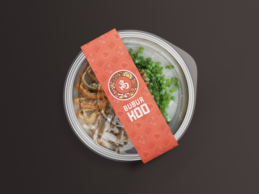
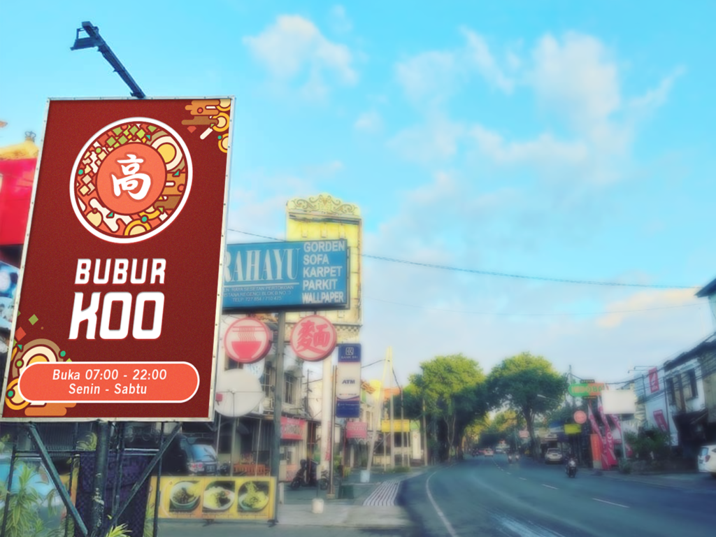
Bubur ‘Koo’ is a small Chinese food restaurant located in the strategic spot between Denpasar & Badung and they mostly cater to takeaway deliveries and dine-in customers. After establishing a secure foothold, they’re looking for a rebranding of their whole logo and identity design to a higher standard and to accommodate further business expansion down the line, such as franchising or variant branching as they are now still focusing on Chinese-style shredded chicken porridge.
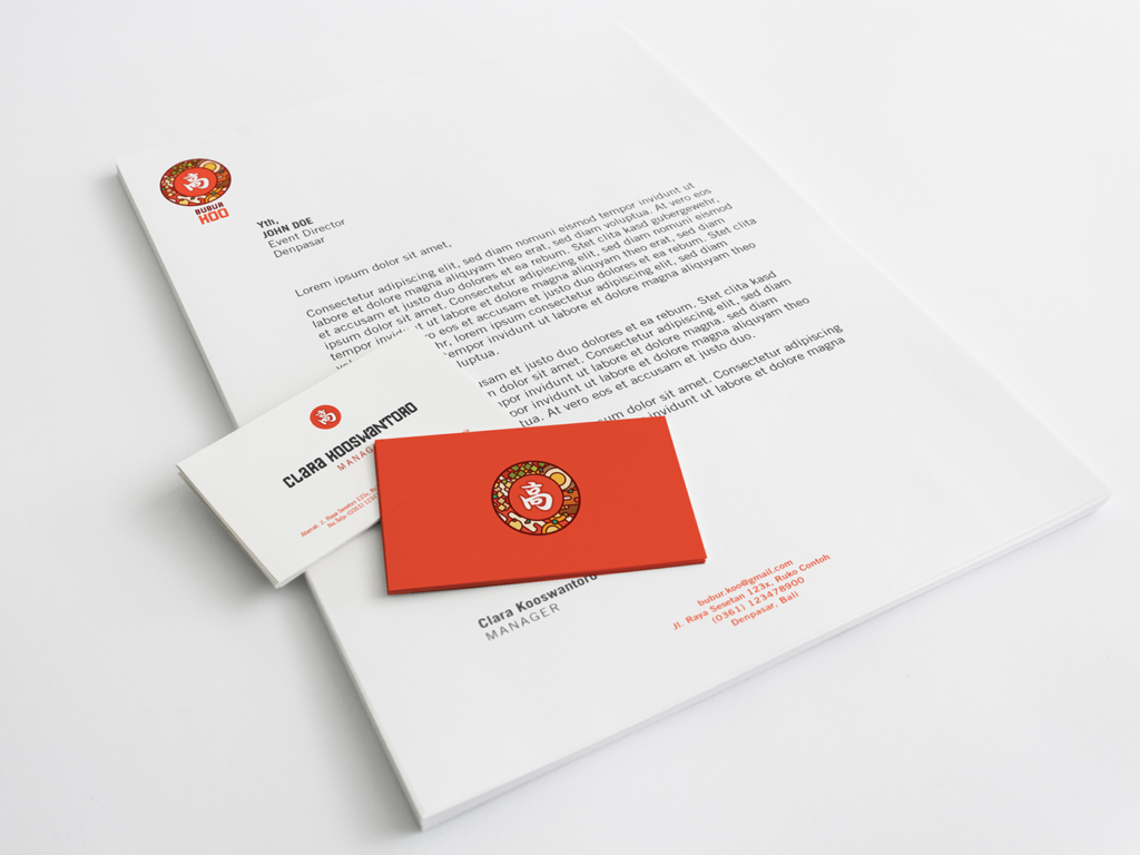
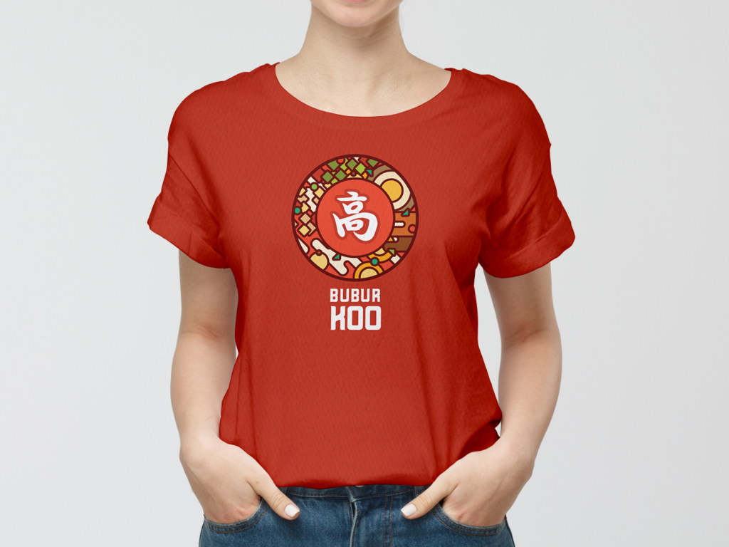
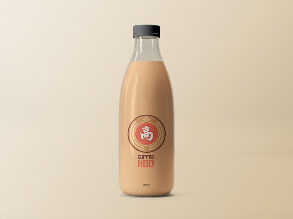
The logogram was inspired by the tendency of youngsters nowadays to take a photo before eating with a top shot of their food, then we add the ancestral Chinese family surname ‘高’ (Koo) character on top of it. This logo was designed to be easily flexible and adaptable in mind. It can evolve for future business expansion while still retaining its brand characteristics. For example, when they’re expanding to noodle cuisines, the graphics below the surname can be adapted to a stylized top-view of a Chinese noodle in a bowl, or if they’re adding café to the restaurant the logo can also adjust to the top-view of a cappuccino.