SENTRIK (Sentral Kendaraan Listrik) is a new electric vehicle distributor that has just launched in 2019 with a vision to be the centre of all-electric vehicle distribution in Bali. After their initial success in penetrating the market and reaching a decent early customer base for electric vehicles in Badung & Denpasar area, SENTRIK realized the importance of raising their brand image to appear more in line with their vision to be the central top-of-mind brand dealership for both their loyal or future electric vehicle customers in Bali.
One of the solutions is to do a major facelift on their old logo. The redesign aims to achieve a more modern & futuristic brand identity that can visually represent electricity, go green, and can synergize well with the logos of other electric vehicle manufacturers that they’re going to partner with, the new brand identity should also be able to give a feeling of prestige & pride in their customers.
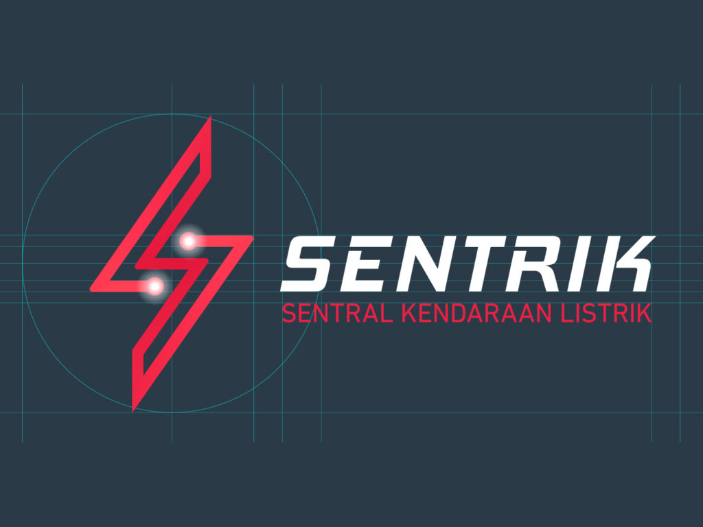
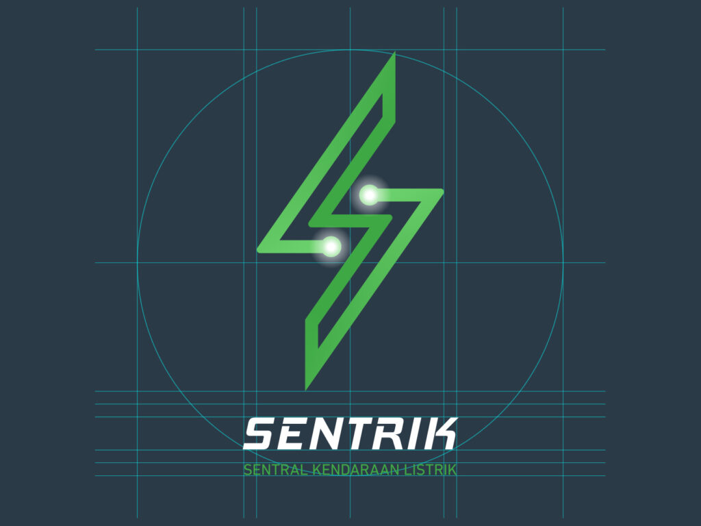
The concept of this logo is based on the combination of the initial S (from the brand name), the shape of a thunder, and an electrical circuit. The circuit line travels and meets in the centre while simultaneously making the circuit shape of thunder and a symmetrical S to symbolize that SENTRIK is the centre for electric vehicles. The lines have three rows to refer to the wholistic nature of SENTRIK’s 3-S dealership which includes Sales, Service, and spare parts.
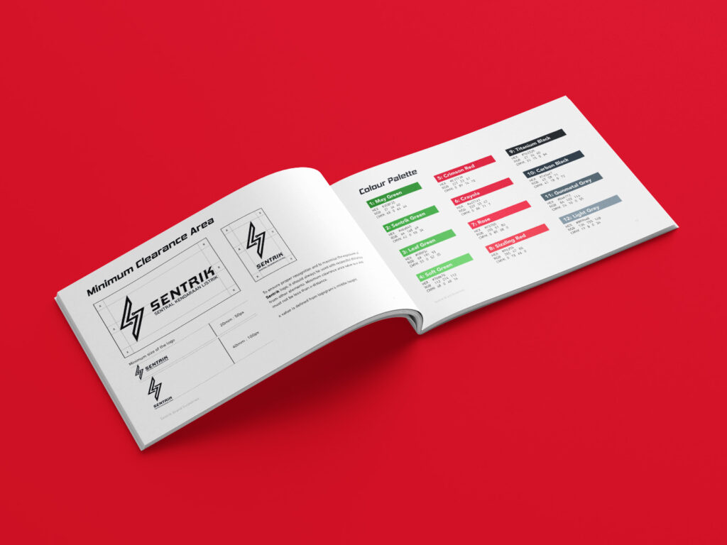
The colour that is going to fill this shape is either Electric Red or Sentrik Green. Electric Red represents SENTRIK’s vision to be the center of Electric Vehicle distribution in Bali and therefore supporting Indonesia’s national movement in shifting to a more sustainable energy source for consumer transportation. Sentrik Green is the original colour of the brand and symbolizes the ‘Go Green‘ energy that is associated with the products they distribute. We designed a visually distinct and characteristic logo so that the brand can take all of its graphic identity from the logo’s visual construct & colour scheme.
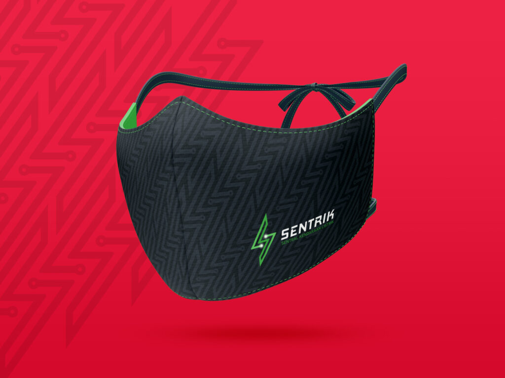
The SENTRIK ‘S-Thunder’ logomark can stand by itself as a graphic element, it has high adaptability and distinctness so it can be comfortably used as a thin background graphic, one-colour graphic, or in pattern design. Other graphic elements such as decorative graphics, icons, or shapes can also take cues from the logo’s visual construction itself, which means as long as it has the same characteristics: such as line-based iconographies, subtle gradients, or usage of lights, then it will be visually consistent for the brand.
We also created Sentrik Patterns which are custom-made for the brand and available to be used as design elements. This pattern can be cropped, layout and opacity-adjusted based on visual needs.