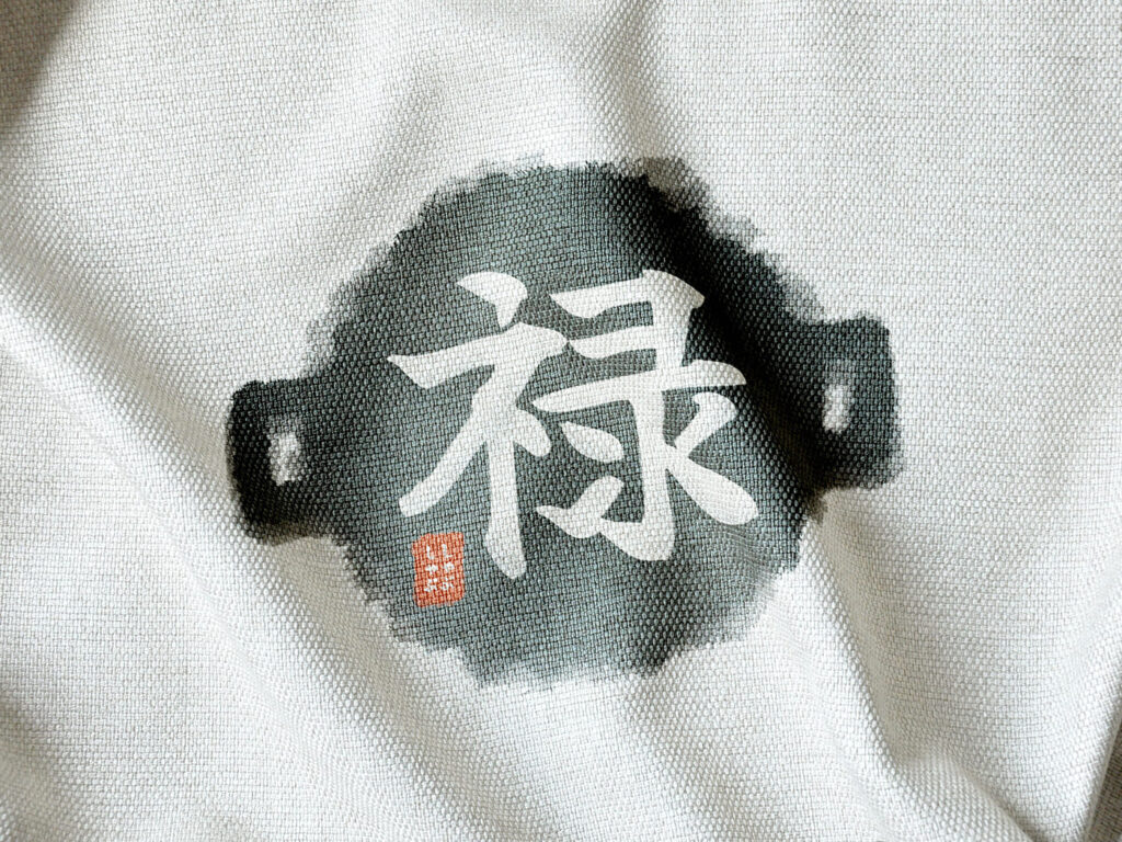
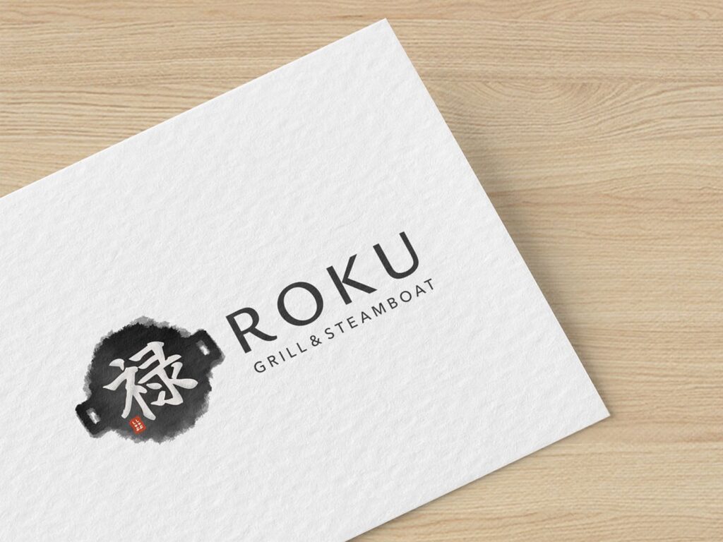
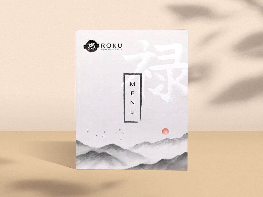
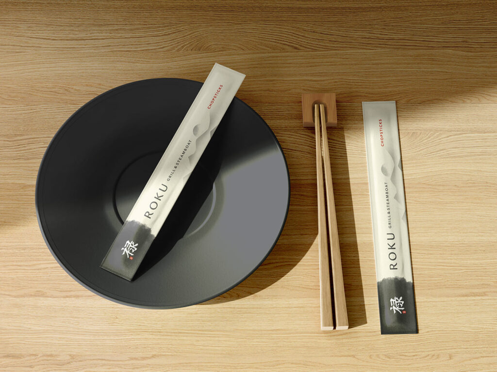
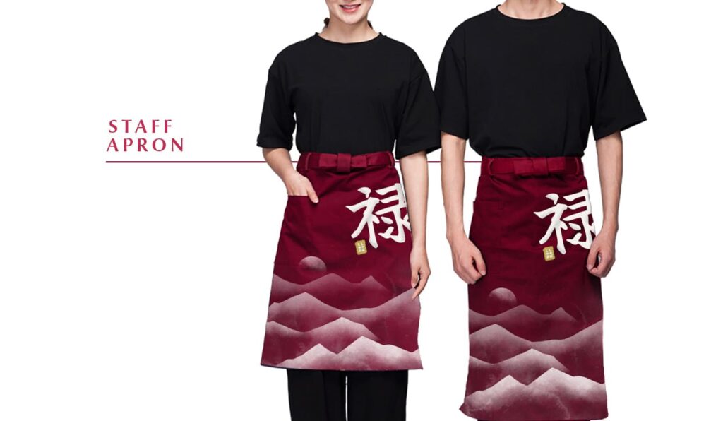
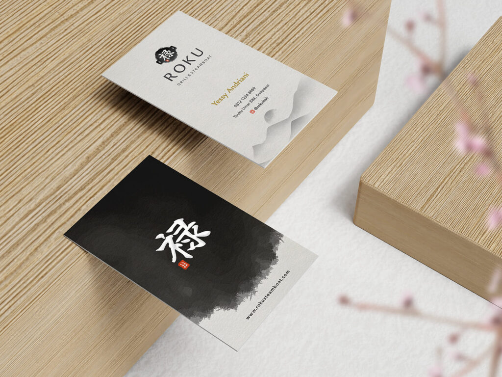
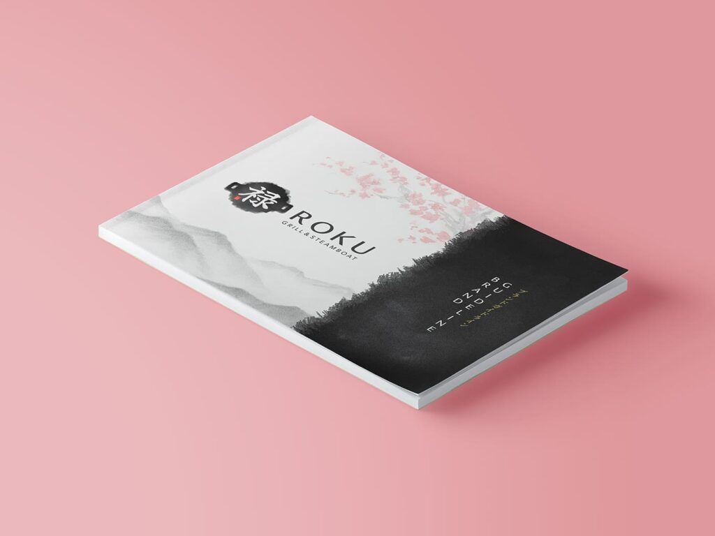
Roku is a Japanese grill and steamboat restaurant located in the busy heart of Denpasar. According to the founder, the kanji for the name was chosen because it represents “Divine Grace.” The most iconic element of a steamboat feast is the hot pot in the middle of the table. We utilize this shape and infuse it with Sumi-e painting style to give it a distinctly Japanese aesthetic.
We create a bespoke handbrushed style logo based on the kanji, with an ink blot shaped like the top-view of a hotpot. This painting style helps evokes a zen-like Japanese aesthetic that brings a feeling of peace and mindfulness as someone enjoy their meal together with their loved ones, friends and families atop a quiet mountain range bordering the heavens above. We chose a typography style that is subtle yet elegant to accompany the graphics.
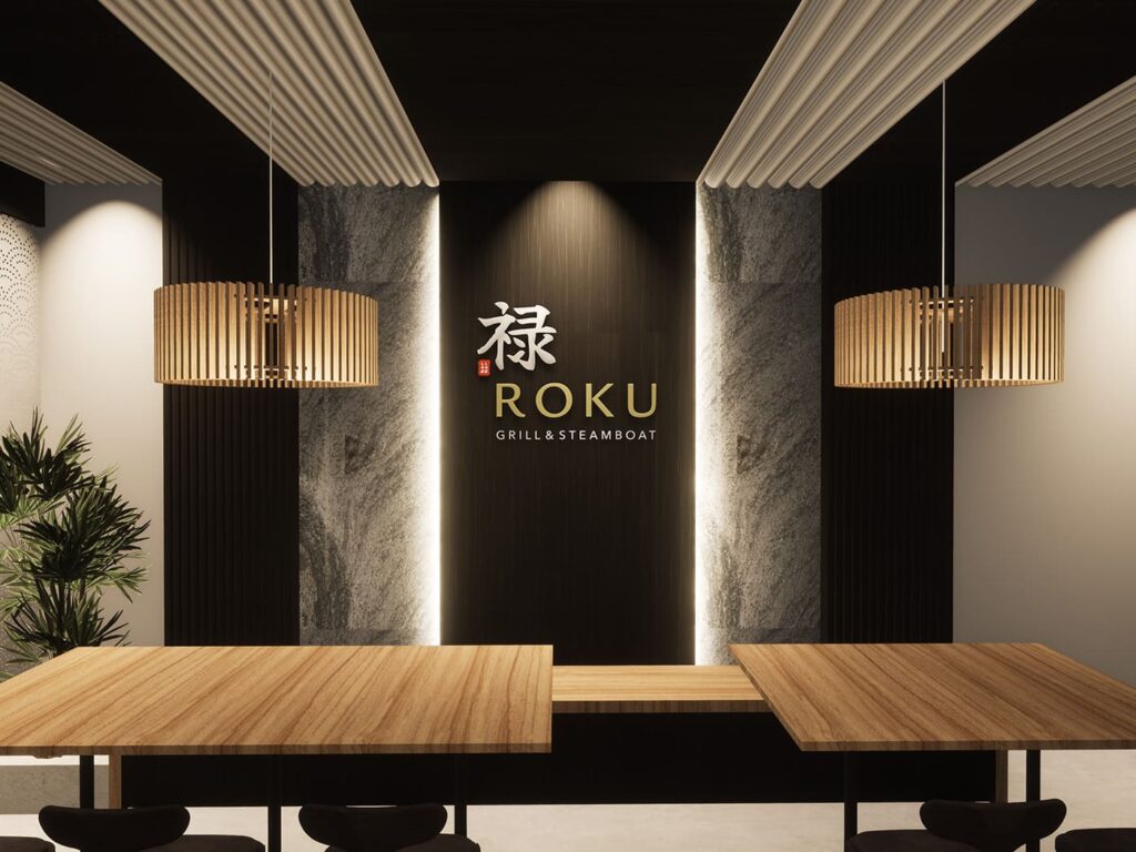
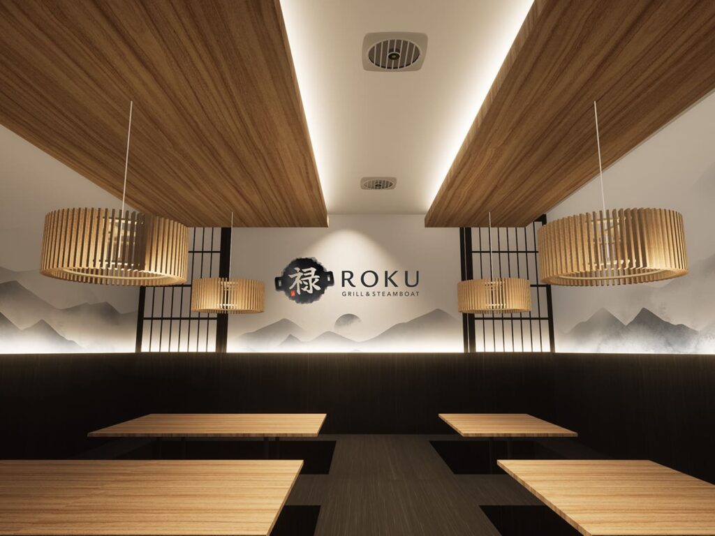
We worked together with Bataputi Arsitektur to create a cozy & aesthetic dining experience for Roku’s future customers. The interior concept is an eclectic blend of modern industrialism infused with Japanese traditional restaurant accents. White and black is derived from the main brand colors while gold is represented visually through the use of wooden material.
With a clearly-defined but flexible key visual, we can easily adapt this brand’s graphic languages into their collaterals, all while still retaining a common identity of the brand. We gave examples on how the brand identity would look when applied to their menu, banner, chopstick pack, and staff uniform. All of this is provided within the brand guidelines that come with the logo’s package. Inside the guideline, you will find detailed manuals on all you need to know about your logo, the concept, what colors and fonts to be used, minimum safe area, possible variants of the logo, dos & don’ts, graphic elements, and collateral design examples.